

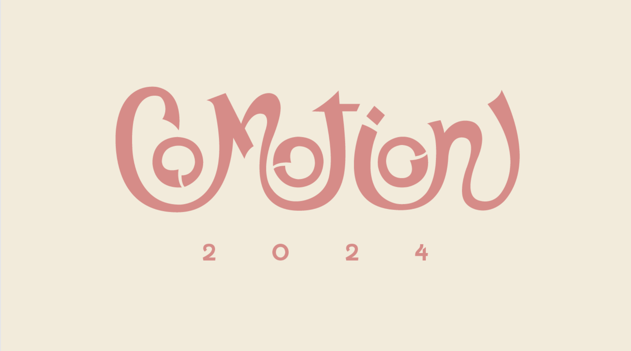


CoMotion is the world’s largest student run motion design conference and for it the branding is created by students for students. This year’s theme was “Make Your Mark” and to commerate the theme, I teamed up with fellow artist Caitlin Crooker to create our own very inspired pitch that works to encompass different mark making eras and different genres of motion graphics. From Prehistoric times and the Renaissance to the Contemporary world, our process mimics the masters who came before us. Our goal was to commemorate the history of artistic mark-making and the endless possibilities in the marks we have yet to make.
TIMELINE: 2 Months (When Available, Part Time as we had Full Time Internships during the process!) PROGRAMS: Photoshop, Illustrator, and ProCreateProcess

Type Analysis

Our main font we chose was Sofia Pro Medium:a blend of timeless sophistication and purposeful design that reflected our brand values. It's the perfect representation to our commitment of delivering seamless results while still embracing our creative spirit.
Meet Fenwick Bold, a quirky yet elegant sans-serif font that blends black letter and calligraphic elements. From showstopping titles to process book work, Fenwick Bold would have been our go-to choice, adding a dash of sophistication and charm to our designs.
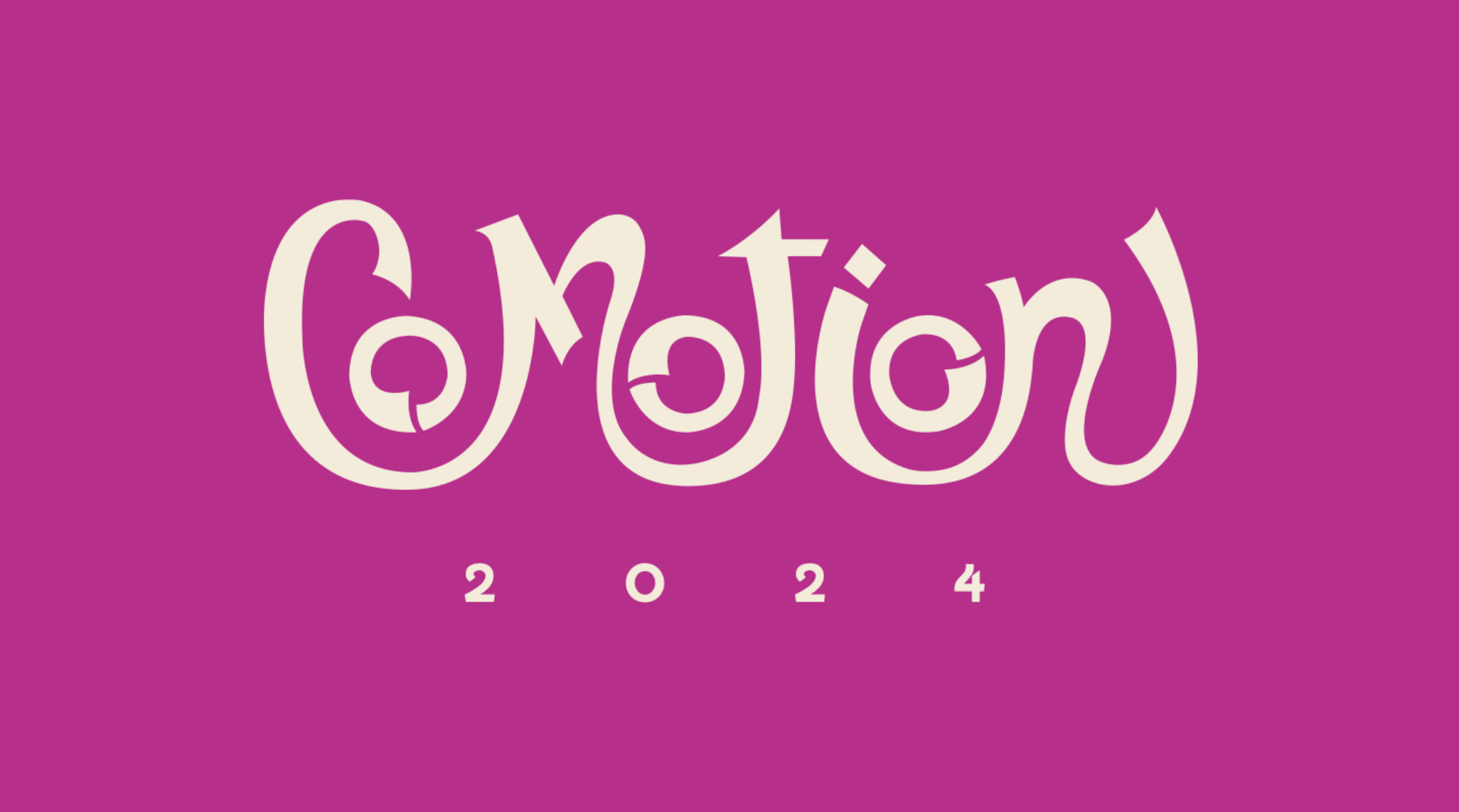
Logo Breakdown

Time to get the ruler out! Over the course of 2 months, Caitlin and I met up with skilled motion designer and graphic designer Josie Glassman to get a quick workshop on the power of grids! From there we worked hand in hand, and Caitlin took the lead on cleaning up our logo using grids so that it worked within our all encompassing theme of the golden ratio: a common theme among famous mark making. We went through over 40 variations to land upon this final beauty that mimics that of the art form of Calligraphy!

Color Scheme
The color scheme chosen was done using color science to figure out what moods could invoke the different atmospheres of creativity that each section gave off from elegance, and wonder to refinement and the mystic we wanted colors to represent it all to sell the story as best as possible.
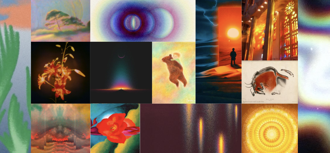
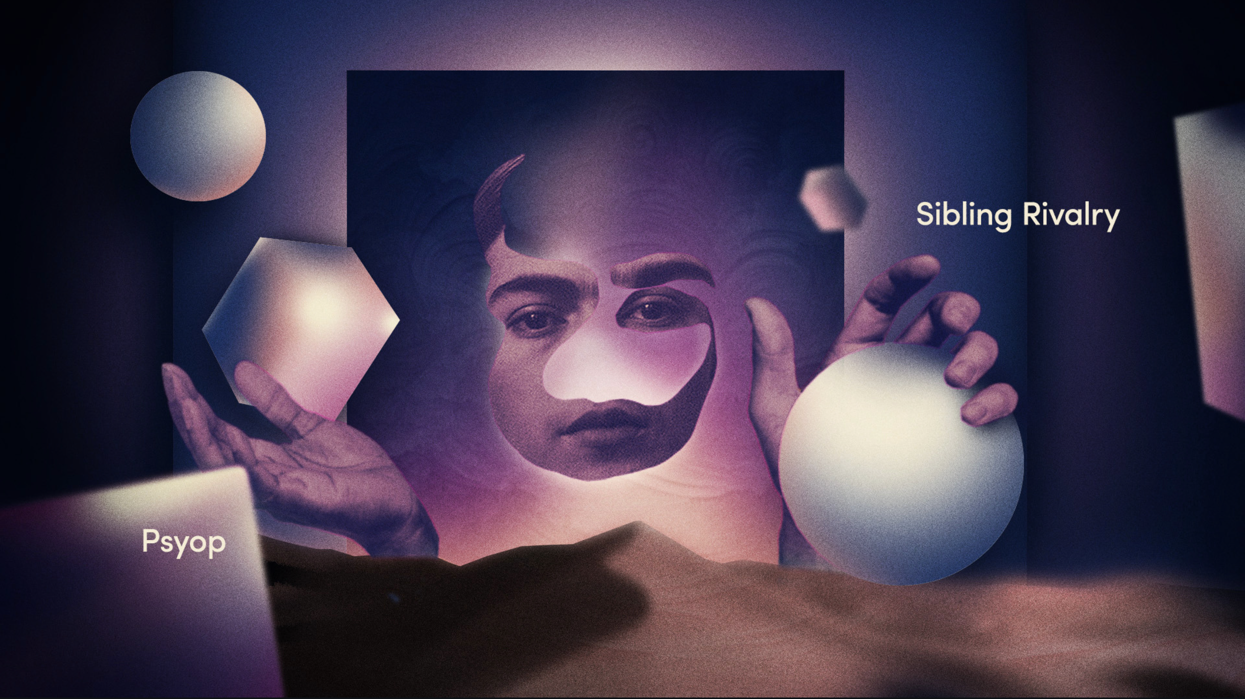
Style Board
To get inspired for the different acts/ history of mark making throughout time, we created a style board to help us become inspired. Ranging from etheral graidents to represent the aha moment to historical cave paintings we wanted to be as well informed of the different eras as much as we possibly could.

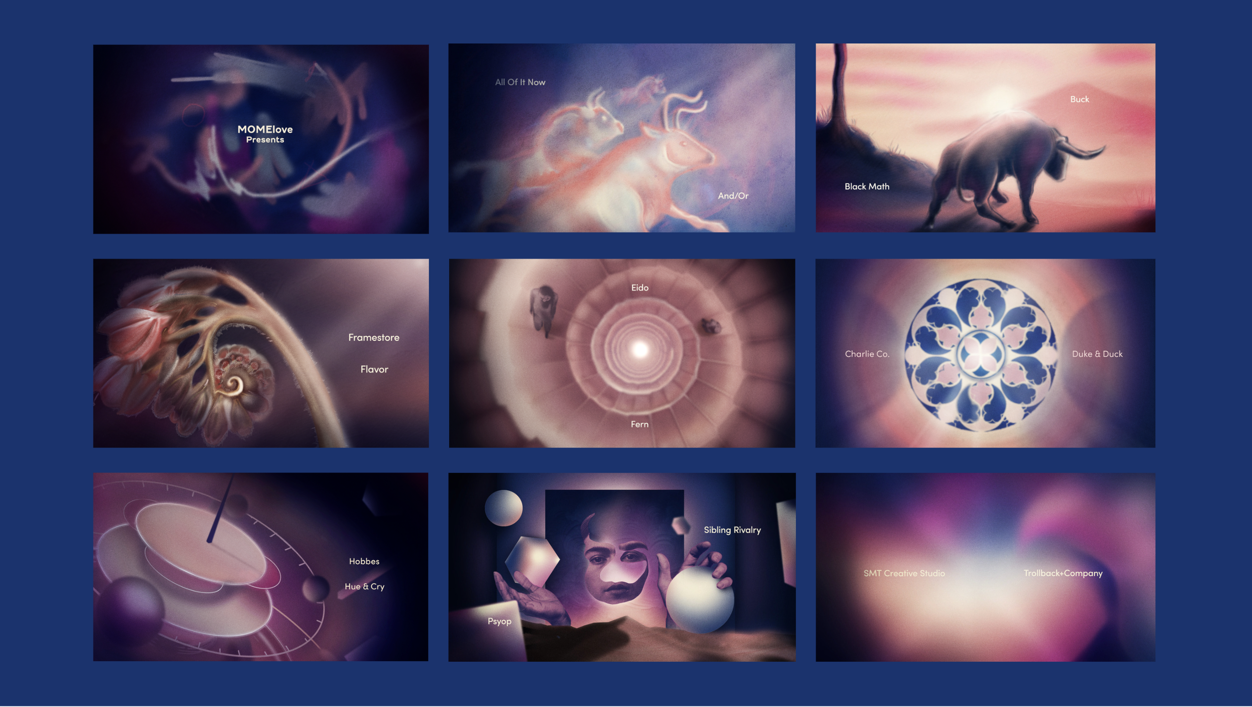
Storyboard

Design Board
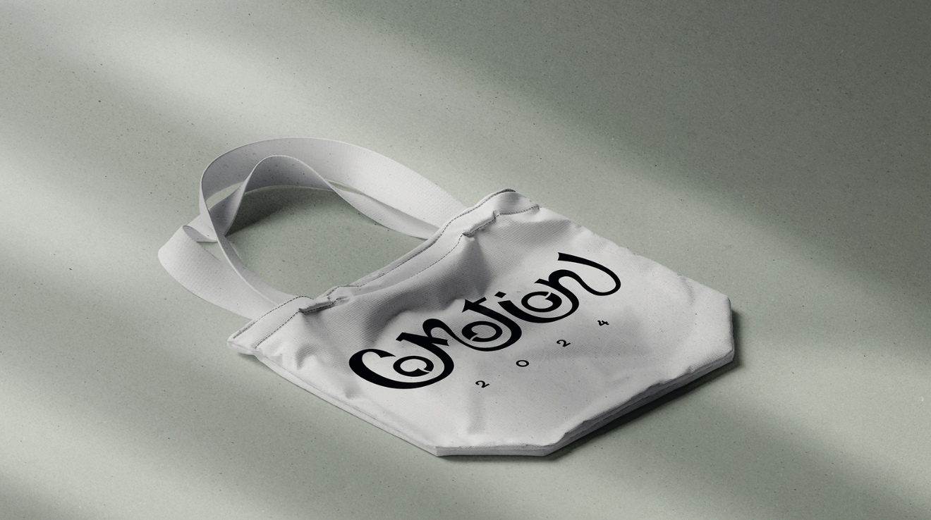
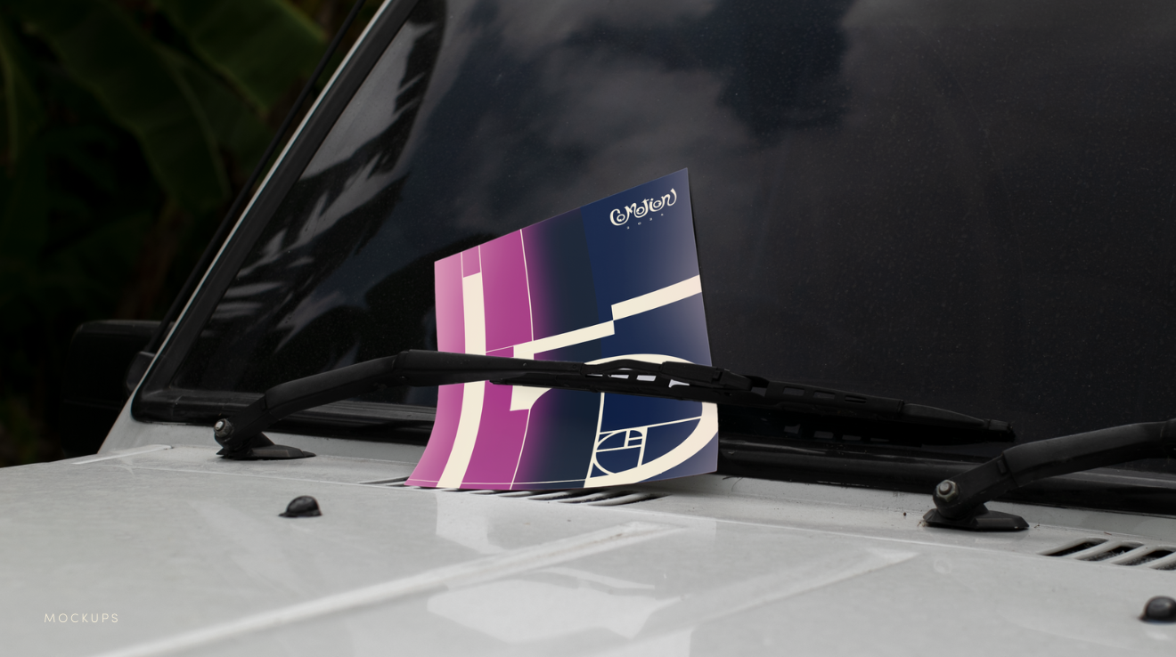
Mockups
Special thanks to Lauren Beyer for helping with us mocking up our designs