For this project, I wanted to get outside my comfort zone and try a new style I had not ventured into before. It illustrates the use of kinetic type with simplified illustration. The goal of this piece was to keep it simple and elegant, while highlighting the impactful phrases. I wanted the words of the speech to stand for themselves and be reflected in the animation, as it is all about keeping things simple and not overcomplicating things. A message I feel all designers can relate to and feel inspired by. To find out more about the design journey, you can find the process down below!
TIMELINE: 2.5 WEEKS PROGRAMS: After Effects and IllustratorProcess:
Type Analysis
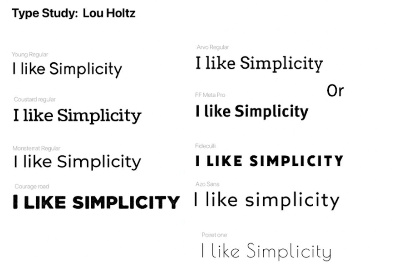

Due to this project focusing on primary kinetic typography, I decided to deep dive into type studies in the early phases of development. I felt finding the right type was key to matching the tone of the speech and getting the audience engaged. I decided in the end to simplify the text by using 1 font (Sunshine) once I got into designing.

Script Decision

Color Scheme

Early Design Exploration


For my first proposal, I proposed doing the project in the tones of blue and gold with orange as a highlight color. After critique and some playing around with different color schemes, I decided to go an entire different route with the colors. I decided upon using a greyscale scheme with a gold accent color to brighten it up a bit and reflect the tones of the speaker and the phrases he was saying better.
