SCAD STARTUP is a design sprint hosted by SCAD Pro and Flux that allows students to bring their innovative ideas to life! Student ideas flourish in a way that allows them to connect with industry leaders who share their insights and vote on the winning concepts. I am the Motion Design Team Coordinator/Designer, Producer, and Sound Designer for 2023 event. For this project, I envisioned, designed, and curated the concept for the main animation while my partner Harshitha Suresh animated the piece. To wrap it up, I used my sound design skills to create a fun quirky sound composition that encapsulated the energy of the piece. Besides the main title, I worked on some social media deliverables and loading screen for the website. Look below to learn about the process!
Process
This project was collaborative from beginning to end. The team worked through roadblocks and challenges that arose along the way in tandem with each other. I enjoyed the experience as it allowed me to learn how to work as a team player and how to take feedback and implement it into my work. It was an interesting challenge as we were an ocean away for a large part of production, but great planning and meeting often allowed for us to succeed in bringing the piece to life!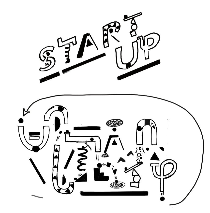
It all has to start somewhere
The first part of the process for this project was to start out with the big question: What is the logo going to look like? The branding package created by the UI team centered around colorful shapes, so I thought: What is the best way we can incorporate and reimagine simple shapes into an innovative logo and animation? That is when the idea hit me. Why don’t we make the shapes and letters themselves a geometric machine that takes the viewer on a journey? The idea of a mechanism was spurred by the 2023 theme of “Embracing the Unorthodox” and exploring something new and innovative.
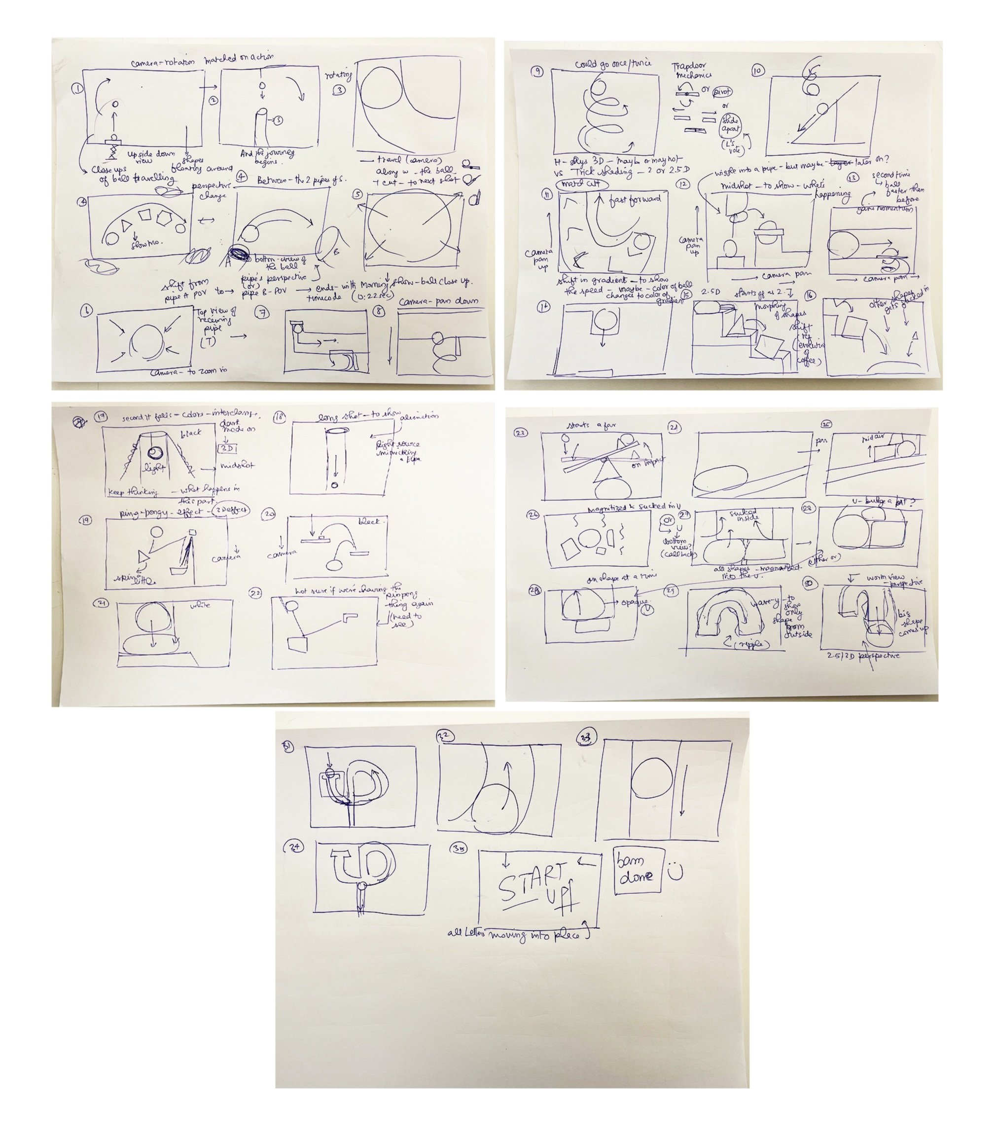
Storyboard Implimentation
After coming up with the mechanism itself, the next step was to think and consider how to frame each scene so that it is continuous and exciting. Breaking down the logo sketch, alongside my partner’s input, we were successful in being able to figure out a game plan that worked out well in making the logo into a shot by shot system.
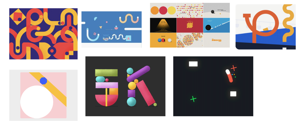
Inspiration Board
After ideation, next came implementation of style. With the StartUp UX visual team look in mind, I looked at various shape animation styles to see how I could design something that looked more enhanced yet simple for the project. For this project, I got to explore the idea of playing with simple shadows and clean look, venturing outside of my traditional comfort zone.

Design Process


. The original coloration of the logo was made using the original UX hex codes given but upon further exploration, it was decided and pitched to the team that StartUp needed a logo with some variation in tones to allow for more balance within the logo. Adding some saturation and contrast created an easier transition from our quirky logo to the standard conference logo design in the end animation.
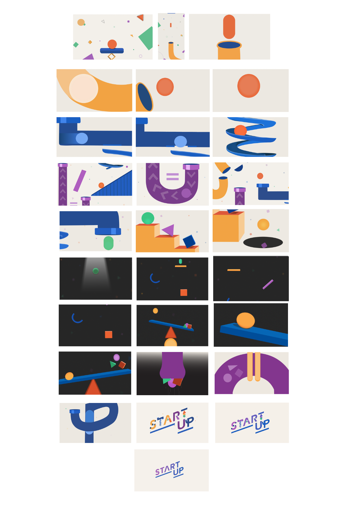
Design Board

These were the two design directions I explored within this project. After further consideration, and after my partner begun the animation, we decided to make a few edits. The edits we decided upon are as listed below:
-Change the launch of scene from the first s pipe into a worm hole view and add shapes in the background to support the perspective change and sense of depth.
-Remove the shapes from the background and arrows on purple pipe to simplify and add more cohesiveness.
-Change the stair scene to be one color for each asset for easier animation transitions.
-Combine the ping pong scene choices and move close up angle to that scene from the succeeding “teeter totter” scene to cause transition to feel smoother.
-Change background from dark to light during the “vacuum pipe” scene and make it a sudden light switch moment instead of animated gradient.
Social Media Posts and Other Deliverables
For StartUp, our first task was to design and animate a short sequence for Instagram to announce that StartUp was coming soon. For this social post, I worked on design while my partner animated.
The social media team needed title cards for interviews on IG reels. I designed and animated these title cards to help bring branding to the reels! I sent them an easily adjustable template so they could modify these as needed with the new text changes.
For loading purposes on the website, I animated and designed a loading bar that loops.
