This project was a collaborative project with fellow motion designer Stephanie Sandoval. Having been tasked with the job of rebranding a show, we decided to cook up some fresh branding for the award winning FX on Hulu Show The Bear . This recipe of design and animation was curated to be a full encompassing design package that plays into the story of The Bear. The Bear is about an up and coming chef named Carmen Berzatto, who decides to return home to Chicago after his brother’s sudden death to take over the family sandwich shop. In the process, he finds a new kitchen family. Down below, you can find the process behind the project and the various assets we created to build a fire brand for The Bear.
TIMELINE: 6 WEEKS (from ideation to completion) PROGRAMS: After Effects, Photoshop, ProCreate, Cinema 4D, Premiere Pro, and Pro Tools.Sizzle Reel
The ktichen didn’t close with our title sequence as that was only the first course of many. As a part of the full rebrand package we created assets for the whole encompasement of The Bear brand from lower thirds, mortises, endtags, ipad thumbnails, animated billboards, promos, and more we created a little sizzle that gives you an inside to our world of branding for The Bear.
Process
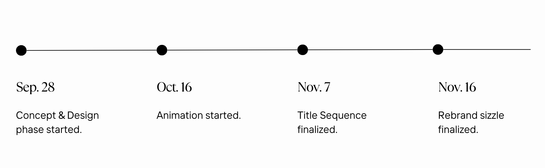
Timeline Breakdown

Brush Study
To keep a cohesive textured look to our storyline, we created a brush study that would allow for us to create a look that is authentically The Bear. These are the brushes we chose in the end.
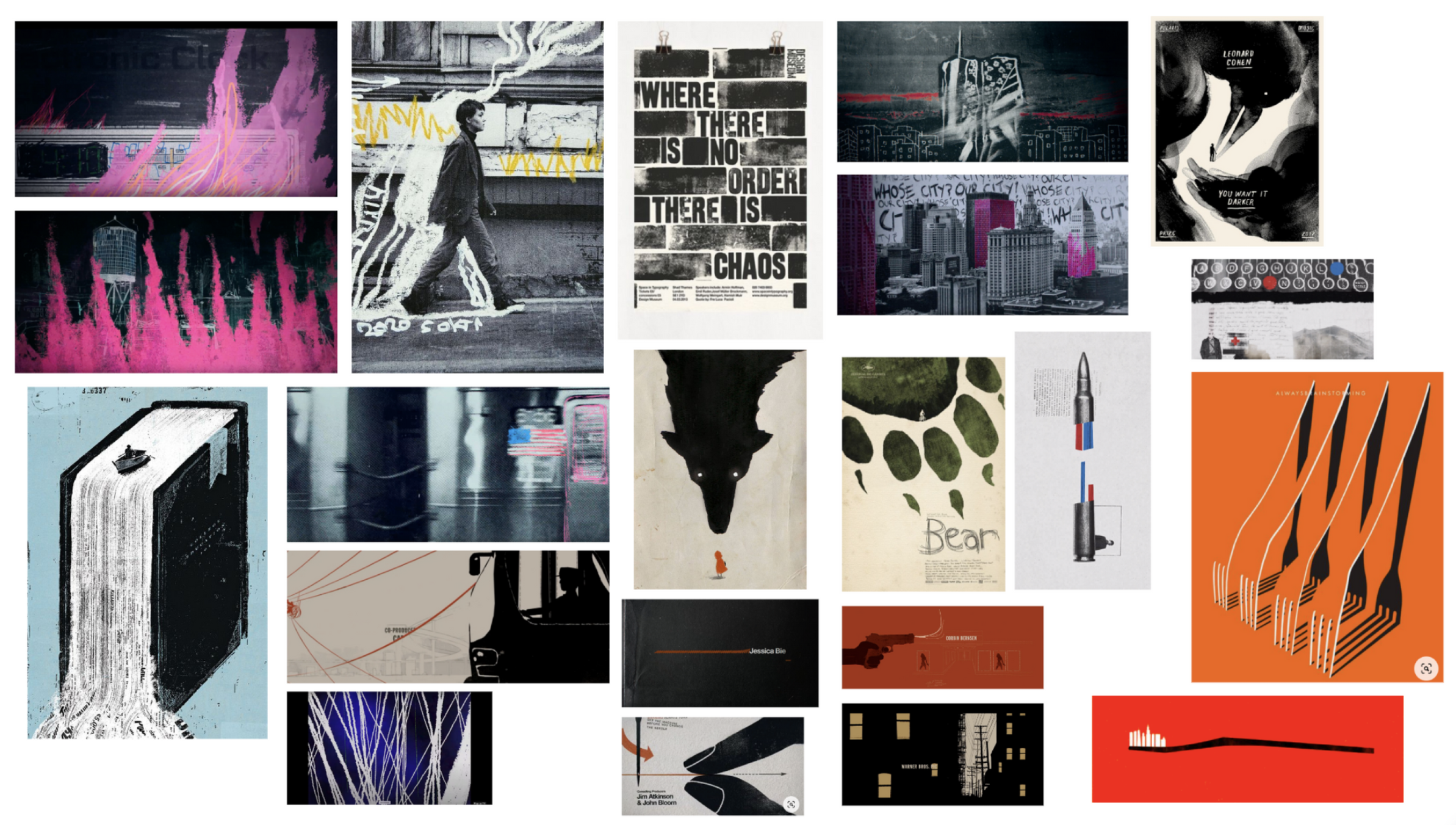
Style Inspiration Study
Before starting our journey in branding for The Bear, we created a style board that was fitting with the grungy atmosphere of the story and the ruggedness of the characters. Our goal was to create a board that gave off a cinematic atmosphere that could inspire us in our journey of creating meaningful and impactful assets for our rebrand package.

Color Study and Scheme
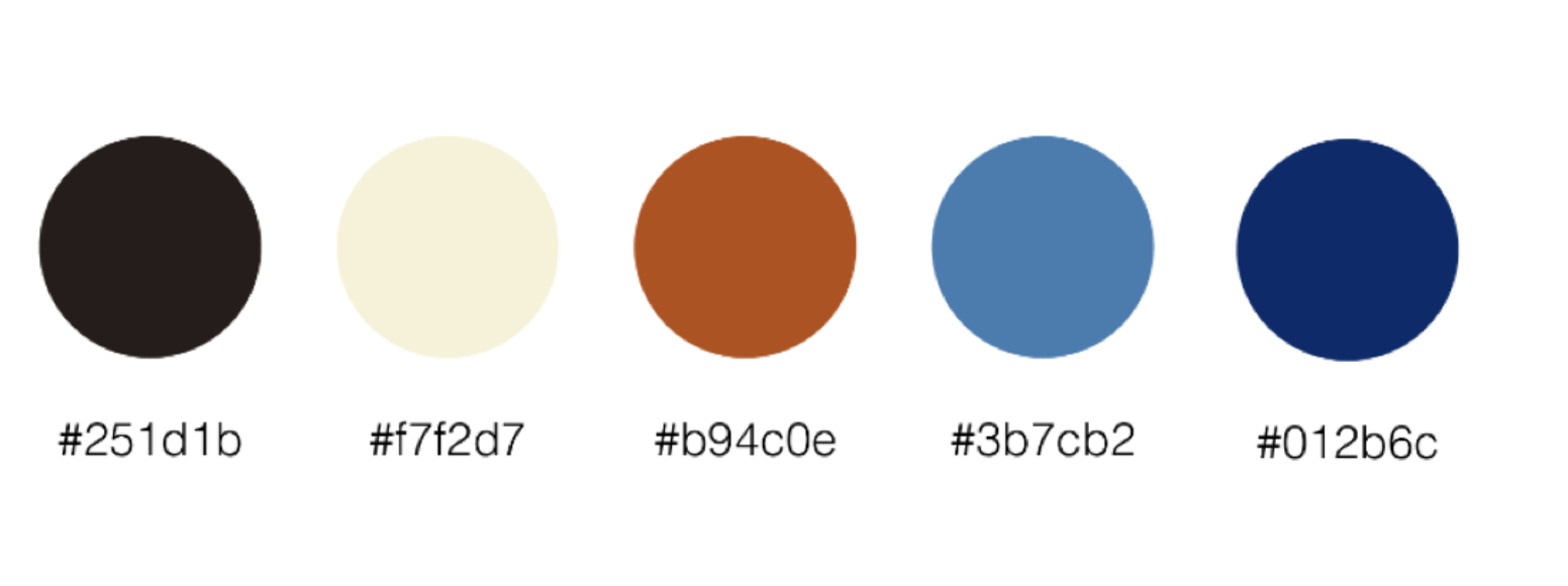
Our color scheme worked to pull core colors from the show that embodied the 70s feel writer & director Christopher Storer, was quoted wanting to embody in the color scheme while also pulling 70s colors that made the color scheme feel authentically Chicago, a core element to The Bear’s plot line.

Visual Motif Study
To create meaning in our title sequence, we analyzed motifs to ensure the title sequence embodied the show and its meaning to the best of its ability.

Production Schedule
To keep on a tight deadline, we created a production schedule that allowed for us to coordinate together our tasks and figure out what needed to be accomplish in the three week time span we had for our title sequence.

Type Study
We decided for our branding to keep with the existing type kit of Helvetica Neue, but add some additional tracking. It’s a nice balance to the textured look of the assets that allow for balanced attention between the visuals and the names of the individuals highlighted in each asset for the show.
